Illustration Teardowns: Layout
A look at layout and composition, framing and angles, and other things that make an illustration appealing…
Today, we’ll look at several contemporary illustration examples, followed with rough greyscale thumbnails to point out bigger shapes and directions that are being emphasized in the layout of those illustrations…
Note that we’ve already discussed focal point which went a bit in to composition and layout as well with things like: rule of thirds, convergence, and other things related to this post.

Please note that all illustrations hereinafter, unless stated otherwise, are the express work of the artist I’m reviewing; I do not take any credit for their works! You can click on the images to visit the artist’s site!
In the spirit of the seminal composition book Framed Ink: Drawing and Composition for Visual Storytellers by Marcos Mateu-Mestre I’ll follow the illustrations with little analysis thumbnails with some observations…
Diagonals


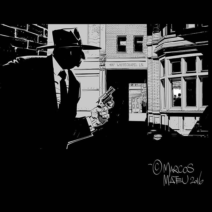
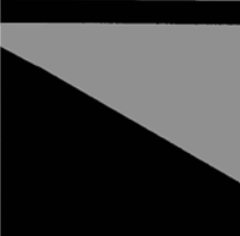
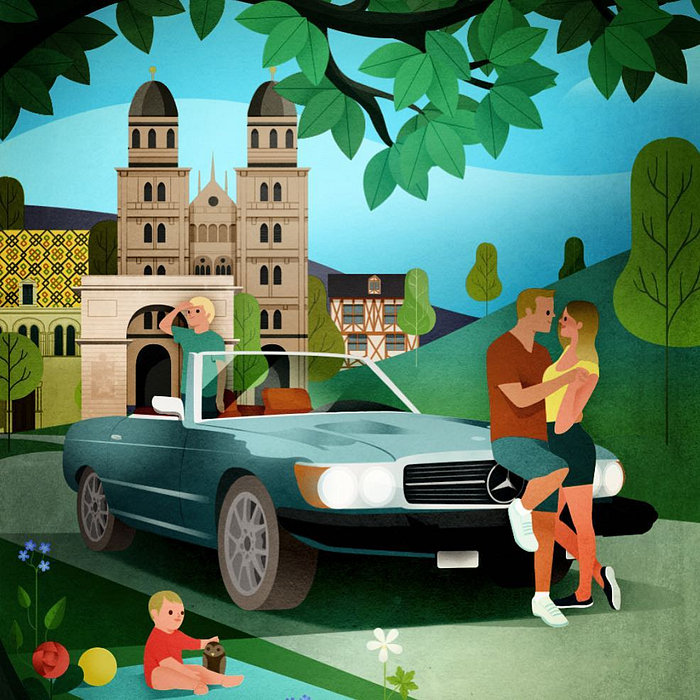
The underlying foundational shapes are the strong diagonals. It’s interesting to see how bland it looks when simplified to this degree. But these diagonals root the movement of the cars in the scene quite nicely. The down shot viewpoint coupled with the tilt adds a sense of movement.
This shot has a strong sort of implied negative diagonal. Perhaps Mr. Mateu-Mestre started with something simple like this and then painted into the negative shape as his ideas solidified? Whether he did or not, I’ve been finding that it’s much easier to first do some random thumbnails using big shapes like this and let that lead to serendipitous ideas.
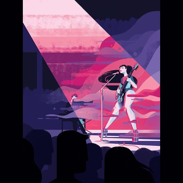
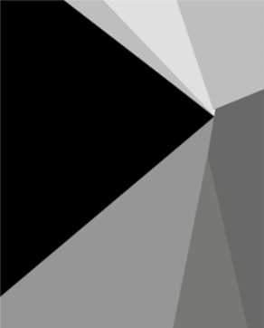
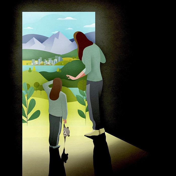
Although there are a lot of various types of shapes in this illustration, the foundational ones are, for the most part some form of a triangular shape. This provides a sense of visual rhythm and continuity to the overall composition.
Rectangules
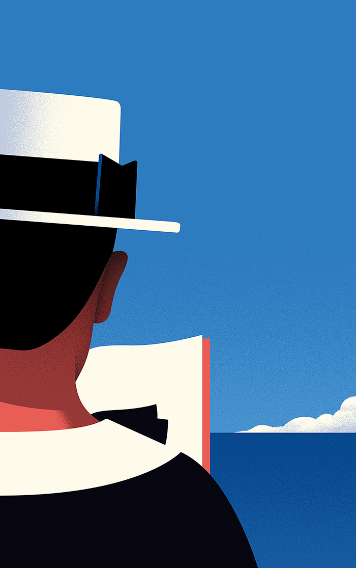
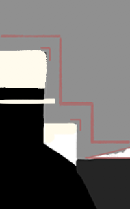
Simplifying this already sparse OTS composition, I noticed that his layout creates a sort of step down pattern. My perfect rectangular shapes are of course made more organic in his illustration. Also, the clouds create an interesting and contrasting triangle that leads the eye in to the book, bow tie, and general focal area. A shape leading the eye like this is known as convergence.
Spirals and other Interesting Shapes
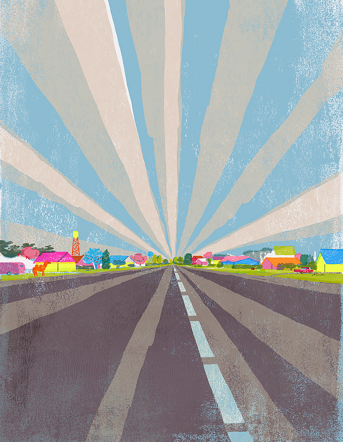
Related to diagonals, ahem, because the directions are still diagonal (maybe I should have called all this triangles!) are spirals. These are great when you want to playfully execute perspective. I think Tatsuro Kiuchi has some great examples of this in his work:
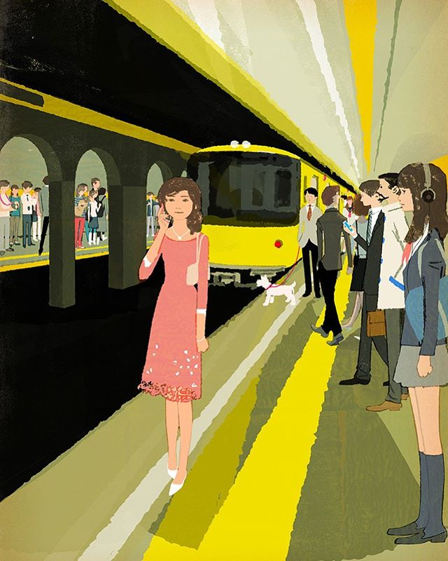
Roughly, these diagonals are all coming from the vanishing point of the train tracks (perhaps under and through the tunnel). The neat thing, is that he disguises this strategy by using organic figures on the rightmost triangle, and arches and a main figure to the left.
And just in case you think these are some sort of accident and not fully a part of his arsenal, here’s another example of his intentional use of spiral shapes:


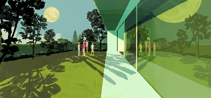
To my mind, the “hook” in both of these illustrations are the stacked parallelograms produced by the light coming in through the window, both creating interesting 45° diagonals in otherwise rectangular compositions.
Ok, the following illustrations won’t be accompanied by thumbnails as I think “you get the idea” of conceptualizing with shapes…
Circular & Wavy


Framing with Overlays
I suppose you could call these hard vignettes, but Ron Doucet calls these framing with overlays so I’ll go with that. Here’s some nice examples from Andrew Lyons who uses this approach wonderfully…
Dutch Tilts and Vantage Point
The Dutch Tilt or Dutch Angle is a technique of composition where:
the camera has been rotated relative to the horizon or vertical lines in the shot. The primary use of such angles is to cause a sense of unease or disorientation for the viewer.
This can definitely come off as cheesy so be careful not to overuse this effect, but here’s a nice and more subtle use of this angle:
Some say Edvard Munch’s The Scream has this, but I don’t really see the viewer’s tilt. Citizen Kane and many thriller movies use this approach as well.
Camera Angles
So many camera angles can be used, and for the sake of brevity I’ll defer to this amazingly clear and to the point image by Ron Doucet:

I didn’t go deep into more techniques like symmetrical vs. asymmetrical or shapes that lead the eye or convergence, and overlapping shapes. But, hopefully this has been enough to get you inspired to seek out more interesting possibilities for how to approach that next illustration layout.
Previous in series: Film Noir Style. Next in series: Shorthands. Also, you may like one of my other illustration teardowns.
Rob Levin is a freelance illustrator. Portfolio: https://roblevin.myportfolio.com/ For illustration work enquiries, collaboration, or to say hi: roblevinillustration@gmail.com.
Also, you may like to read more of the illustration teardowns articles.
More Resources
Hans Bacher’s Dream Worlds is an amazing resource to learn more about this stuff (and he’s got a new book coming out: VISION — color and composition for film, which I’m excited to get a look at if I can muster up the coin).