Please note that all illustrations hereinafter, unless stated otherwise, are the express work of the artist I’m reviewing; I do not take any credit for their works! You can click on the images to visit the artist’s site!
Drawing from observation is undoubtedly one of the most useful skills an artist or illustrator will need to learn, but, today we will look at using shorthands to quickly create reads or indications of a visual thing. The goal in this approach is to do it quickly, in order to capture the essence of represented object. Later, more time may be devoted to detail if necessary. Shorthands are also used for blocking-in big shapes in a general to specific process. They may also be useful as a learning device to help a beginner visualize complexity. Other practical benefits are had for sketching UX diagrams, whiteboarding ideas quickly, and for art/nature journaling.
Shorthand for drawing figures
Many strategies for blocking in the figure start with gesture, proceed to construction, and then refine with details such as anatomy and shading. A full discussion on figure drawing is definitely beyond the scope of this post (and I’m probably not really qualified to advise on figure drawing per se). But, with that disclaimer in place, I’ll offer a trick to drawing rounded forms geared towards beginners, as rounded forms are required for most figure drawing block in methods you’ll encounter. As a beginner, you’ll probably feel challenged to make these supposedly simple forms look anything close to what is shown in examples you se. Well, try taking a long but effective route as follows…
- draw a super light oval and partially erase back, or reduce opacity
- lightly draw a superimposed cube keeping perspective in mind
- now draw the intended rounded block in
The process looks something like this:


If you’re nit picking the number of steps and/or result, you may be a much more experienced figure drawer then I; and so this cumbersome breakdown probably wasn’t really something that’d be helpful for you in the first place ;)
Shorthand for drawing heads
If you’re interested in drawing heads, there’s a popular shorthand known as the Loomis Method, which appeared in Andrew Loomis book Drawing the Head and Hands. Here’s an excerpt of the shorthand which basically involves creating a spherical shape or circle, and then cutting it at the sides by the temples, and then dropping a line to add the mandible or lower jawbone:

The idea is, if you can remember a few basic steps, you can then place your head in any direction and have a means to get started with a successful block in.
There are many resources to find on google, but this video by REIQ shows how to employ the Loomis method and does a great job presenting how it’s done visually.
Shorthand for composition
Related to my last post on Layout, the use of large grayscale shapes can be used as a means to quickly determine how a composition might look. Using photoshop or similar, you can simple grab a hard brush and a few shades of gray from black to white. If you’re in to analog, you can do the same with markers, brush pens, or a flat brush. I’ve had success with Tombow Dual Brush Pen Set of Grayscale, but Sharpie, Copic, or whatever will work too.
In his book, Sketchbook: Composition Studies for Film, Hans Bacher uses a sort of grayscale drawing technique to produce amazingly beautiful conceptual thumbnail illustrations that later turn in to movies like The Lion King, Mulan, and Beauty and the Beast to name just a few…


Below, I did a loose study (yes, a study based on a study!) from page 8 of Sketchbook: Composition Studies for Film on emotion in close ups:

Why would I do a study of a study? Well, to get small clues as to how the genius brain of an award winning Production Designer’s works. Duh! In this particular study, for example, I learned something about his use of almost 45° angles to build certain shapes in the portrait (do you see these?). I would have probably rounded these areas by instinct, but now I will be aware of this more angular option on a profile. Also, the diagonals give a certain visual motif.
Trees
From the beginning of time, artists have been using various tree shorthands when sketching plein air, or when rendering more cartoony illustrations.
The first to come to mind when it comes to tree shorthand would of course be Rembrandt!
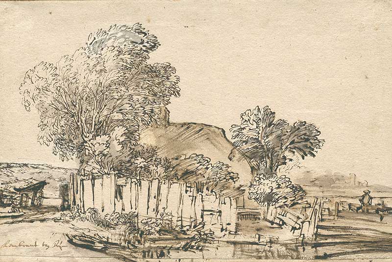

If you examine the shorthand Rembrandt uses in the above two studies, it’s obvious that perfect rendering was not the goal. No, the goal was to produce an indication of what he was seeing quickly. Folks also refer to this with phrases like: “it quickly reads as a” so and so, when discussing an icon or symbol that clearly depicts something. In his trees, the marks are reminiscent of the familiar C curve, but with a randomness to avoid the look of a repetitive pattern. Let’s take at another more contemporary artist’s tree shorthand…


In the above sketches by artist John Wellington, author of Idols Demons Saints, it’s apparent that he may have learned this tree shorthand from Arthur Guptill, presumably from the classic book Rendering In Pen and Ink. If you examine closely, they’re essentially simple C curves mixed with some random squiggles. There’s a slight similarity to the marks we saw earlier from Rembrandt. If you’re cognizant of the bigger bushy shapes, and put more marks where shadows would go, you can make some nice trees like this quite quickly.
By the way, I only have the first volume of Idols Demons Saints, but, I really enjoyed getting the book for perusal on my iPhone on my way to work or at the gym. He talks about many “tricks of the trade” he uses, and unveils his painting and sketching process quite intimately.
Here is more tree shorthand from the artist/publisher Elizabeth Adams:


Regarding these studies, Elizabeth Adams states:
The past few days, I’ve been experimenting with different drawing techniques for foliage, searching out a shorthand that captures the rhythm, busyness, and emotional tone of trees and shrubs at different times of the day. I’ve been thinking about this problem for years, and keep coming back to it, but now I have a bit more time to explore possibilities. These are just some initial sketches done with my Lamy fountain pen, quickly. I’ll move on to washes and broader areas of ink and contrast, but I’m curious how far one can go with just a pen.
Tara Roskell, host of The Idea Medic Creative Podcast, www.ideamedic.com, and a collaborator of @kickinthecreatives has a nice shorthand for quick studies, and not just for trees—she uses this sort of technique to capture the moment quickly in her nice landscape studies:


Note the use of straight line hatching to indicate value? Obviously, this is not to be found on the originally observed objects, but it’s such a familiar shorthand to viewers, they intuitively know it’s and indication of more value.
Ok, enough trees, but, here’s a sketch that uses similar diagonal hatch lines to indicate value from the illustrator we did our very first teardown on, Karolis Strautniekas:


Here are two cartoons, first by the French artist Sempé, and next by Quentin Blake. Both use the shorthands we’ve discussed to indicate foliage:


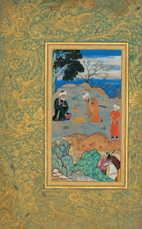
Japanese and Chinese art, and also Persian miniatures have variations on the tree shorthand we discussed earlier…


Here’s an example of using shorthand effectively, but in a very modern and lovely illustration by up and-coming young illustrator Laurent Ferrante:

If you wish to delve deeper, there are a couple of nice little tutorials from nature journaling instructor John Muirs Laws. One on drawing Oak trees, where he starts with a sort of similar shorthand approach, but then adds a bit more to his tree renderings. He also has a video lesson called The Five Minute Landscape which uses shorthand to indicate rocks and a landscape layout.
Playful lines
We’ve seen some of the standard shorthands for things like trees and figures, but, you may want to use your own shorthands. Exercising your line control and doing line explorations can lead to your own inventive shorthands. Here’s some tasty line exploration from Gizem Vural who definitely has her own style and an uncanny ability to make interesting marks:


Arent’ these line explorations absolutely fabulous? Well, here’s the sort of award winning work that this sort of line exploration has led to Gizem Vural:


I suppose we could have gone in to plein air painting, field studies, etc., but this post is already too long! Hopefully you’ve enjoyed looking at the various uses for drawing formulas or shorthands. We spent a lot of time on heads, figures, and foliage—for no particular reason—but, you can use shorthands for anything that can be draw. So pick up that dusty sketchbook or journal and get out and make some quick studies!
Previous in series: Layout. Next in series Matteo Berton. Also, you may like one of my other illustration teardowns.
Rob Levin does technical things by day and illustration by night. You can view his blog at https://developtodesign.com and illustration at: https://www.behance.net/roblevin. Also, you may like to read more of the illustration teardowns articles.
More Resources
I just found this great little snippet of making foliage in pen and ink with some simple pencil guidelines and it’s definitely worth a 30 second view to see the type of techniques we’ve been discussing in action 😉
Rob Levin is a freelance illustrator. Portfolio: https://roblevin.myportfolio.com/ For illustration work enquiries, collaboration, or to say hi: roblevinillustration@gmail.com.
Also, you may like to read more of the illustration teardowns articles.
And another updated find are the process shots on this beauty! https://www.behance.net/gallery/55155863/The-illustration-work-of-TVCF-(US)-for-Kooksoondang